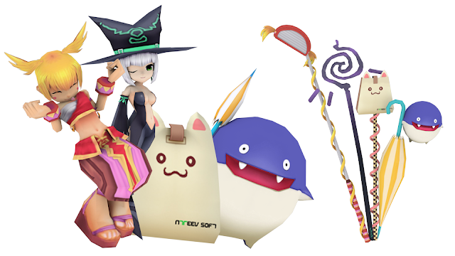
Custom 3D Model work for Pangya Celebrity

In the years of 2017 to 2018 i worked in collaboration with Leia to create and setup custom 3D Model Content for Pangya Celebrity (Private server).
Bellow is a history and walk through of my design process for each model.

By day, my job in real life is to make 3D Models as Environment Art so combining the two interests of 3D Modeling and Pangya into one to share with the community was an incredible opportunity. I learned a lot from the experience as a modeler and i hope my art style continued the foundations set by SeeDark and the many other talented Pangya Art Directors.

|640x360

Special Caddie Clubset Development


The Special Caddie Clubset was my first attempt at making a Clubset (or any item) for Pangya. It was an interesting process and took quite some time to complete from conception to the finished product.

The clubset was released on Pangya Celebrity on Feb 13th 2017.

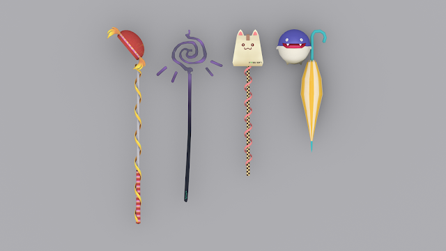
The idea of the clubset was to create a clubset that Incorporated design elements of the Caddies from the game into each club. I’v always been a fan of this design process and i think it really ended up being the perfect first clubset for me, since it used so many familiar and already existing designs. It was more about how to use these designs in a creative way, rather than a big focus on the designs themselves which helped speed up the whole process.

I first got the idea of a “Caddie Clubset” when looking at Pangya Japans clubset design entries. In Pangya Japan, they’ve hosted many design contests in the past which let community members design clothes, items or clubsets. The winners of the contest get their design made into a 3D model and put into the game. I’v always loved this idea of taking concept art and turning it into a real product. I wanted to do something similar with this project.
|400x320

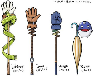
Concept Art created by a Pangya Japan community member.

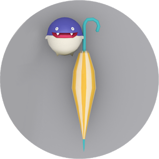
The art above is where i got the idea of a “Caddie Clubset”. I took a lot of inspiration from this design and took my own spin on it. As you can tell, the putter ended up being very similar to the design shown above. I loved the idea of Dolfini and her umbrella being a putter so i decided to take that idea and turn it into a reality.
|320x320

The Putter - Dolfini

The Putter is obviously based around Dolfini. The design as stated above, comes mainly from the concept art. Creating a Dolfini 3D model from scratch was surprisingly easier than expected. Dolfini mainly consists of a sphere with arms and legs pulled out of it. It’s a pretty simplistic design and it took more creativity in the texture work than it did in the mesh itself. The umbrella was also fairly simple to produce. Through out this whole design process i wanted to keep things relatively low poly to better match Pangya’s art style.

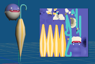
I actually learned how to correctly UVmap and UVunwrap just so i could get this clubset working in Pangya, as it requires a single texture file per club to work. It’s a skill that took a long time to learn but one that i’ll carry with me through out my whole life.
|320x216

My first ever UVunwrapped texture

The handle of the umbrella as you can see is quite low poly. Same goes with the bends and curves in the umbrella itself. This not only helps performance but also really makes it fit well into the Pangya world, which was my main goal. I wanted to replicate that same style that Pangya is so well known for. This was really my first time creating 3D Models with such a bright and cartoonish art style so it was an interesting challenge. Since transparencies in the textures were not aloud in the design, i had to make individual poly’s for each of the umbrella’s points.
|320x221

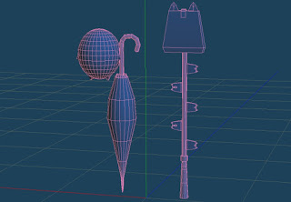
Early development of the Putter and Wedge

The design changed slightly over time. Originally the shape of Dolfini was much more oval-like. As you can see, The design of the Papel Wedge also changed slightly in early development. Prototyping and hearing feedback from a few people really helped the direction of the design.
|320x320

The Wedge - Papel

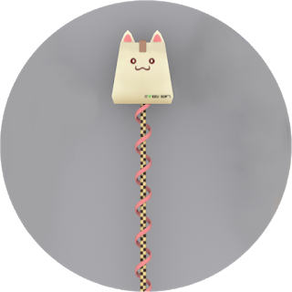
The Wedge was designed after Papel. This was also my first time creating (or rather remodeling) my own Papel 3D Model so it was interesting for sure. The Papel itself wasn’t too difficult to replicate, i used a variety of planes to keep poly count low and keep with the artstyle. Recreating Papels face and textures was actually the hardest part for me personally. I didn’t want to just use or steal Pangya’s model, nor did i want to use or steal Pangya’s textures so i made them all myself 100% from scratch. The end result of the Papel model itself turned out really good. It really does look and feel like Papel, though i wish i changed the “Ntreev” logo, but i also wanted it to feel official so i decided to keep it.

The main bit of the clubset has a checkered design, taking two main colours from Papel. The dark brown and sand colours are checkered and tiled across the stick which gives it a very interesting and consistent look. Surrounding the clubset is a ribbon-like shape which wraps around the design. It too takes the same pink shade from the Papel to keep with the consistent theme and look.
|320x320

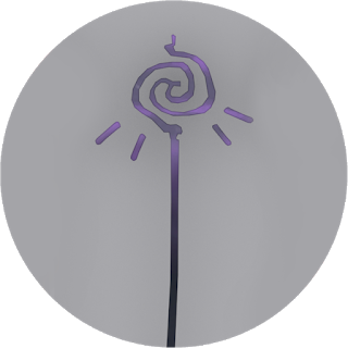
The Iron - Cadie

The Iron is based around Cadie. Cadie is a magical Witch from Pangya Island and she’s one of the leading designs on Pangya so i wanted to have a club dedicated to her. The Iron is shaped like Cadie’s “Wand”, something that’s actually found in her official art many times.
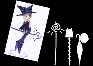
|320x228

Cadie holding her Wand in promo art

You can see it above. She’s constantly depicted holding this Wand in most of her art, its even shown up as a clubset in the eary 2005 version of Pangya Mobile. Yet despite all of that, it’s never been an actual clubset in Pangya PC, so i wanted to make this a reality.

The Club features the same design shown in her art, with a variety of organic curves and lines, all spiraling to one central point. It’s a very interesting design that really gives the clubset a magical feel. It features four floating lines around the head of the club which other clubsets haven’t really done before. The textures were fairly simple to produce, it mainly involved shades of purple bleeding into each other, with green “Pangya text” on the base of the stick.
|320x320

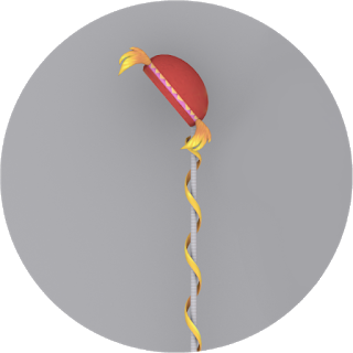
The Wood - Lola

Finally we have the Wood, which is based on Lola. This Club was by far the hardest to design as i wanted it to feel very similar to the majority of woods out there already, while still being based around a caddie. The Wood features Lola’s iconic “Wings” on the base, which is actually Lola’s hair. Her hair then also wraps around the entire clubset similar to the pink ribbon on the Papel club.

The base of the clubset takes a similar design from her outfit where its wrapped in white cloth. The bottom of the club has the familiar pattern from Lola’s bracelets on her wrists, recreated and placed around the club. It has a very tribal feel and really screams “Lola” colour and design wise.

From Concept
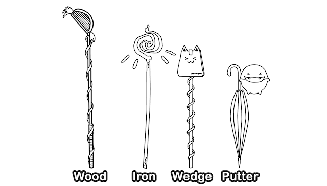
|640x361

To Reality

|640x360

The Special Caddie Clubset - Wood - Iron - Wedge - Putter -

Overall, this clubset was a blast to make. Each design is so unique but yet it comes together to form a very consistent and colorful Pangya feeling Clubset. I’m incredibly grateful to have the Clubset in Pangya Celebrity, working perfectly. There were a few shading issues we encountered, and i do believe it could be due to the way the normals were facing, and the way the smoothing options were set, so hopefully next time around these issues can be fixed. Until then, the clubset still looks fantastic in-game and it fits neatly into the world of Pangya. As my very first Clubset for Pangya, it’s a fantastic model and design and i can’t wait to produce even more content going forward.


Special Caddie Clubset Trailer
1 Like

|640x360

Papel Pod-Cast Comet Development


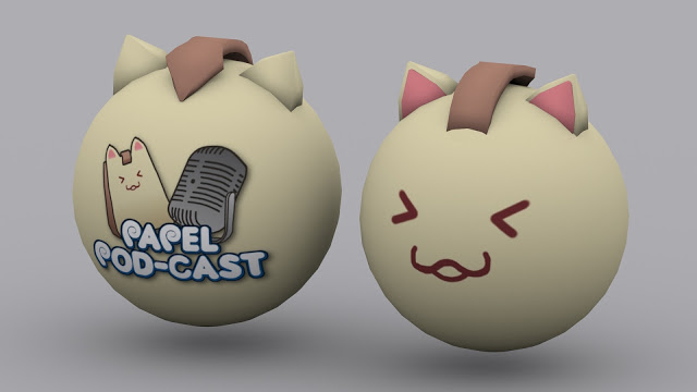
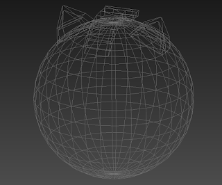
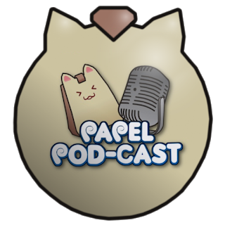
The Papel Pod-Cast comet has been the quickest item i’v developed. It was completed from concept to final model/textures within 15 mins. Basically, Leia needed a ball for the Papel Pod-Cast colab and wanted to experiment with custom comets. This is the worlds first custom comet model-wise, and there are a few kinks with lighting and smoothing that we have to still work out but it turned out pretty nice.

|320x265

Papel Pod-Cast Comet in Wireframe

The comet itself is fairly simple in design. I chose to base it off a Papel since its the most iconic and easily recognizable thing in Pangya. It’s something basically everyone loves and instantly recognizes so it was a great starting point. It’s also something i’m experienced in designing around (See the Wedge for the Special Caddie Clubset)

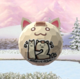
Pangya Japan’s 12th Anniversary Papel Comet

Now yes, as you can see above this isn’t the first time a Papel ball has existed in Pangya. The only instance of this is the comet above, which comes from Pangya Japan and is exclusive to them for their 12th anniversary. As if it actually took 12 years to get a Papel themed ball

(also come on Pangya PC, wheres our Dolfini Comet? Hint Hint)

The comet from Japan is nice, but its a bit too simplistic. The eyes are a bit dead looking and the logo is way to intrusive into the design. Yes the Papel Pod-Cast ball is themed around Papel Pod-Cast but i also wanted it to be a comet that everyone can enjoy, be it fans of the Pod-Cast or not. So i chose to put the logo on the very back as to not be so intrusive.

|320x320

Papel Pod-Cast comets back view

The design was pretty easy to pull of, things like the ears and handle make it more unique looking and detailed compared to other comets while still fitting in with the style. I’m really happy with the comet, and i’m glad i got to make it. Hopefully in the future we can iron out the lighting issues we encountered, other than that it’s looking good going forward in terms of custom content.

Lots of possibilities and exciting opportunities await!

|640x360

Lustful Papel Development


Lustful Papel technically wasn’t actually my first attempt at a custom Caddie Skin. Last year i actually tried making a custom Papel Skin themed around “Love” similar to Lustful Papel, however its design was a bit different and the way it was created was much lower quality.

|400x180

My first attempt at a Caddie Skin from early 2016

As you can see from above, some elements like the eyes and overall “Love” theme made it into Lustful Papel. However the overall design quality was much lower back then. At this time in early 2016 i was only using programs such as paint, which as we all know are not optimal for making textures. Considering the limitations it looked okay at the time, but Lustful Papel is worlds better.

So how was Lustful Papel designed? Where did the idea come from?

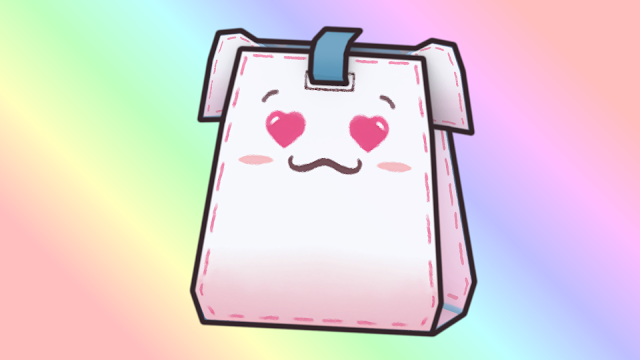
Well Leia and I wanted to make a custom Papel Skin which revolved around the theme of “Love” to time up with Valentines Day, as something exclusive to the server. I wanted to put in some nods to that old Papel design since it was my first, so i started with the heart shaped eyes first. Lustful Papel was originally going to only be a Papel Skin, however we later decided against this to make the Papel feel more special, and to give it its own set of stats (and to also make it a permanent item rather than a rent-able skin)

|400x226

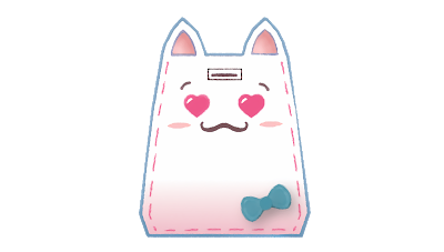
The original Lustful Papel Design as a Papel Skin before the change

As you can see, the design didn’t change too much. Some things had to be removed such as the bow in the bottom left of the design, due to the way the other model is UVmapped. Since we wanted it to be its own new Papel, we had to choose the “Elephant Papel” which is a different Papel. The model is slightly different and again so is the way its UV mapped so i had to work around these restrictions creatively.

|400x223

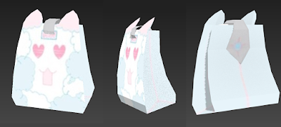
Elephant Papel turning into Lustful Papel during development

Taking the existing (finished) Lustful Papel Skin and mapping it correctly to the new UVmap of the Elephant Papel was an interesting process. I learned allot about how to texture similar things to other UVmaps so it helped a ton. I had to change some of the Lustful Papels design to fit the new model, such as create a design for the ears, fix up the top of the Papel face and re-do the back.

|640x360

Lustful Papel, complete and ready to put in-game

The finished design looks great and i’m really happy with it. Its a unique spin on Papel and really gives him his own identity and twist. Its bright, uses Pink and Blue effectively to contrast each other and everything just pops perfectly. I love that i took the things that worked well (the theme and eyes) from my first design, and carried them over to Lustful Papel.

It was a joy to create and i’m happy with the end result. Glad people are using him and enjoying the design. Hopefully this won’t be the last.


Papel Pod-Cast Comet + Lustful Papel Trailer

|640x468

Special Easter Clubset Development


The Special Easter Clubset took about a month from conception to completion to create. The clubset is unique in that it’s themed around the festive holiday “Easter”. It was quite a challenge coming up with the concept and experienced quite a few changes along the way.

The clubset was released on Pangya Celebrity on April 16th 2017.

At first, i thought an Easter themed clubset or item would be fairly easy to concept. Eggs, Bunnies, Chocolate and Chicks were all early themes and eventually made it into the final design. The clubset started off with concept art, as with anything i create.

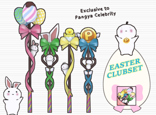
From Concept

|640x361

To Reality

|640x360

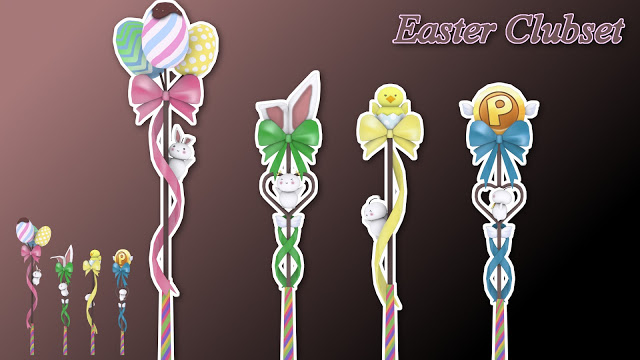
Special Easter Clubset Wood + Iron + Wedge + Putter

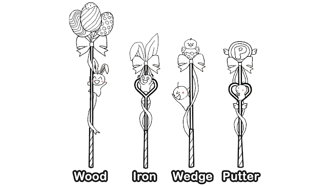
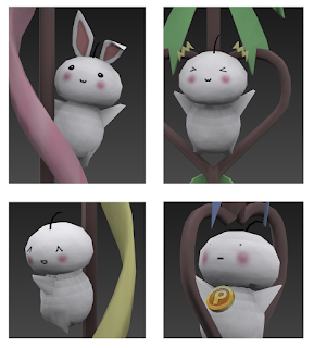
This is the final version of the concept art i created before modeling the clubset. The final design consisted of various Easter themes. The Wood features three unique Egg designs, with their own pattern and colours. The Iron features bunny ears, the Wedge features a Chick hatching from an Easter egg and finally the Putter features a Pang coin with wings. A bow and ribbon wrap around each clubset linking the designs of each together. The Wood and Wedge both have a single ribbon, while the Iron and Putter have two. The Wood and Wedge have the standard clubset shaft while the Iron and Putter both bevel out into a heart shape. Finally, a central theme around this clubset is the Mochi creatures that hang on each club.

|289x320

Four Mochi’s with their own unique personality

You can see each Mochi above has their own personality, look and design. The Mochi on the wood is wearing bunny ears, the Mochi on the Iron is about to fall off and has expression marks above its head. The Mochi on the Wedge is swinging around on the clubset and finally the Mochi on the Putter is wearing a Pang necklace which ties into the Pang themed Putter.

This was honestly my favorite part of the design for me. Having Mochi’s hanging onto a clubset was a really great idea that i’v had for a while now. Putting it into practice was fairly difficult. Modeling the body’s from scratch was surprisingly hard. I wanted them to look and feel low-poly while still having detail. The faces took some time to perfect but came out nice, and posing each Mochi was fun.

|400x338

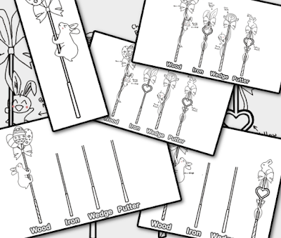
Many of the Design concepts the Clubset went through

This clubset took a long time to develop. It changed its design quite a bit, but with a lot of communication between Leia and myself we came across the design you see here today. As a designer, i’m proud of the Design we finished with. It’s unique, cute and represents Easter well. It also fits in very well with Pangya and is of high quality. I’m honored as always to see my work in Pangya Celebrity and i can’t wait to contribute more in the near future.


Special Easter Clubset Trailer

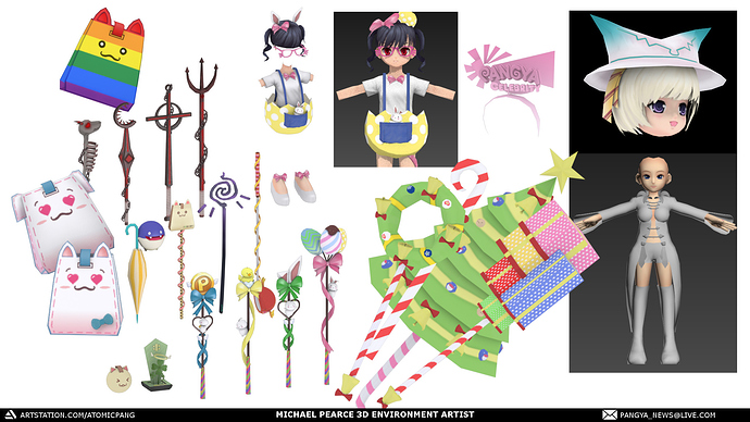
A variety of work i did for Celebrity, including some pieces which never released due to time constraints/technical issues.

While Leia and I worked close, we always looked for new ways to push the boundaries of whats possible in Pangya.
One of these ways which sadly never saw the light of day as an official release, was our own (and the worlds first) private server custom course.

We wanted it to fit the world of Pangya naturally, but we had many restrictions. We had to basically swap out/replace a course to make it into our own since there’s no way to add a new “course slot” for lack of a better term. So we chose to do it on the least played course in the community, Wind Hill.

We wanted to transform Wind Hill into a fun new course we prototyped called “Sweet Tooth Turbines”
coollogo_com-162021338

As you can pick up from the title, the course was going to have a candy theme.
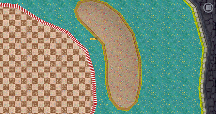
Bellow are some very rough texture prototypes for style which we were looking at.

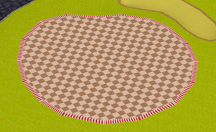
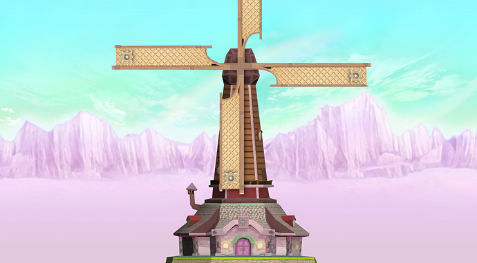
Here is the first prototype texture we made as a test for the turbines in the valley.

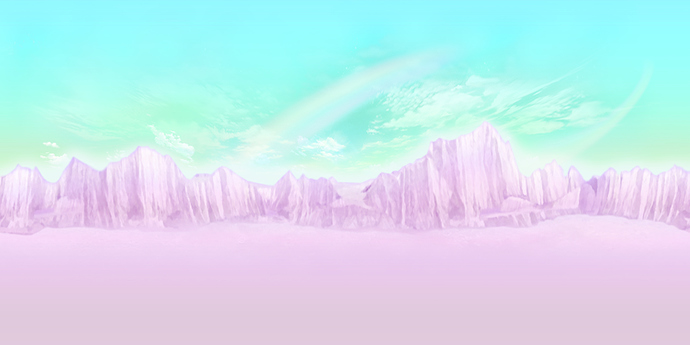
And the custom skybox created for the course.

Everything was very rough, but it was mostly for testing until we moved on to modeling.

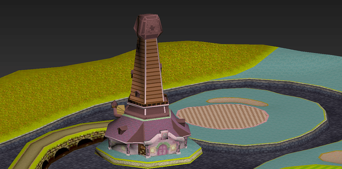
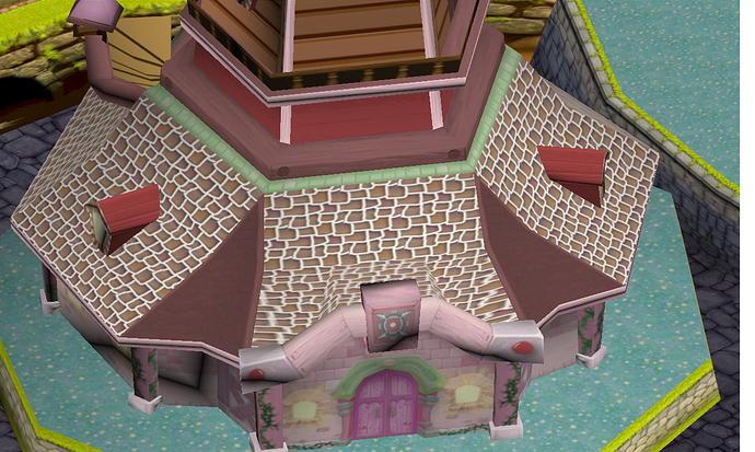
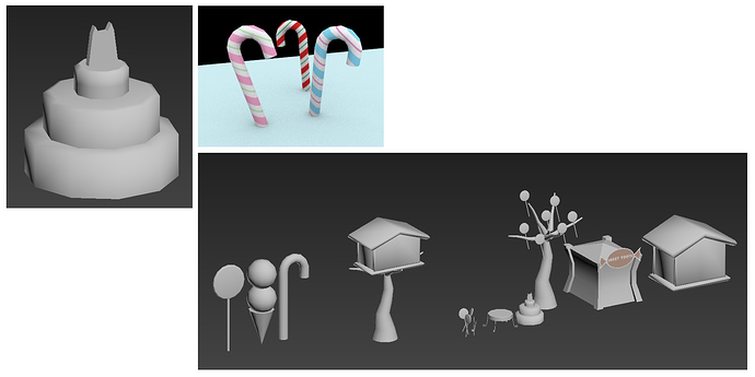
At this point we were confident we could go ahead with the project so i began modeling some basic props and environment art for the course, including candy houses, giant icecreams and various Pangya themed candies.

As i mentioned, ultimately the project got scrapped due to time and technical difficulties on Leia’s end, but it was interesting to work on from at least an art direction side, and i hope people use what we learned to one day make a course of their own.

1 Like

Wow, all of this is very nice and beautiful

Oh man. I remember some of these models from long ago. A shame the Sweet Turbines course was never implemented in Celebrity. It would’ve been a great addition. To be honest, it would be nice if you finished the design in general, or used the assets for a custom map background for fun. I’m not sure if you need permission to do that, but it would still be nice to see the lost assets be put to use somewhere.

Technically, if @atomicpang still has the assets lying around somewhere, I could make a theme for the forum using the skybox

(the current page background is Eastern Valley…I believe)

Wanted to prepare more page themes using other courses anyway!